Identity branding for a forward-thinking tech company
Conceptualizing the Brand
Our team began by immersing ourselves in Circuitry.AI’s mission, audience, and values to define its core identity. We created mood boards and explored visual themes that conveyed intelligence, trust, and innovation. This groundwork led to initial sketches and drafts that captured the brand’s essence.
Mark and Brand Exploration
To hone the design, we explored various Icons, fonts, color palettes, and layouts, ensuring every element aligned with Circuitry.AI’s identity. We focused on balancing simplicity with a futuristic aesthetic, making subtle adjustments to enhance clarity and cohesion across different applications.
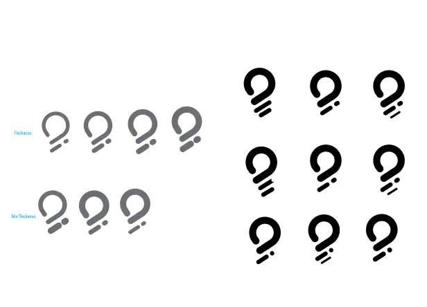
Recognizing the need for a scalable and recognizable logo, we tested how the design performed across different sizes and contexts. We refined structural details, ensuring the logo maintained its impact whether displayed on a website, mobile app, or marketing materials. Client feedback guided these refinements, ensuring the final design effectively represented Circuitry.AI.
Tightening Final Design & Color Explorations
Finalizing the logo required sharpening details, fine-tuning spacing, and removing unnecessary elements while maintaining meaning. Our goal was a design that seamlessly adapted to various mediums while embodying Circuitry.AI’s innovative and intelligent brand identity.
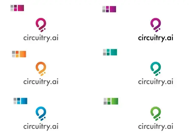
Color exploration played a crucial role in defining the brand’s personality. We tested different palettes to find a combination that conveyed both technological sophistication and trust. By optimizing contrast and readability, we ensured the logo remained striking in both full-color and monochrome formats.
Final Brand Identity
The final logo design is the culmination of a thoughtful and refined process, capturing the brand’s essence in a simple, memorable mark. It should be versatile, working seamlessly across different platforms and sizes, from business cards to billboards.
Brand Identity
Establishing the brand
+ Company Overview + Elevator Pitch + Vision & Mission + Target Audience + User Personas
THE LOGO MARK
+ Primary Logo + Logo Colors + Logo Meaning + Logo Variations
BRAND STANDARDS
+ Typography + Primary Colors + Supporting Colors + Logo Restrictions + Graphic Elements + 2/3rd Rule
At this stage, the logo is fully polished, with well-balanced elements, a clear color scheme, and typography that complements the brand’s identity. The final design is not only aesthetically pleasing but also functional, creating a lasting visual impression that effectively communicates the brand’s message to its audience.