Rebranding and reimaging the roofing contractor’s web presence
The Challenge
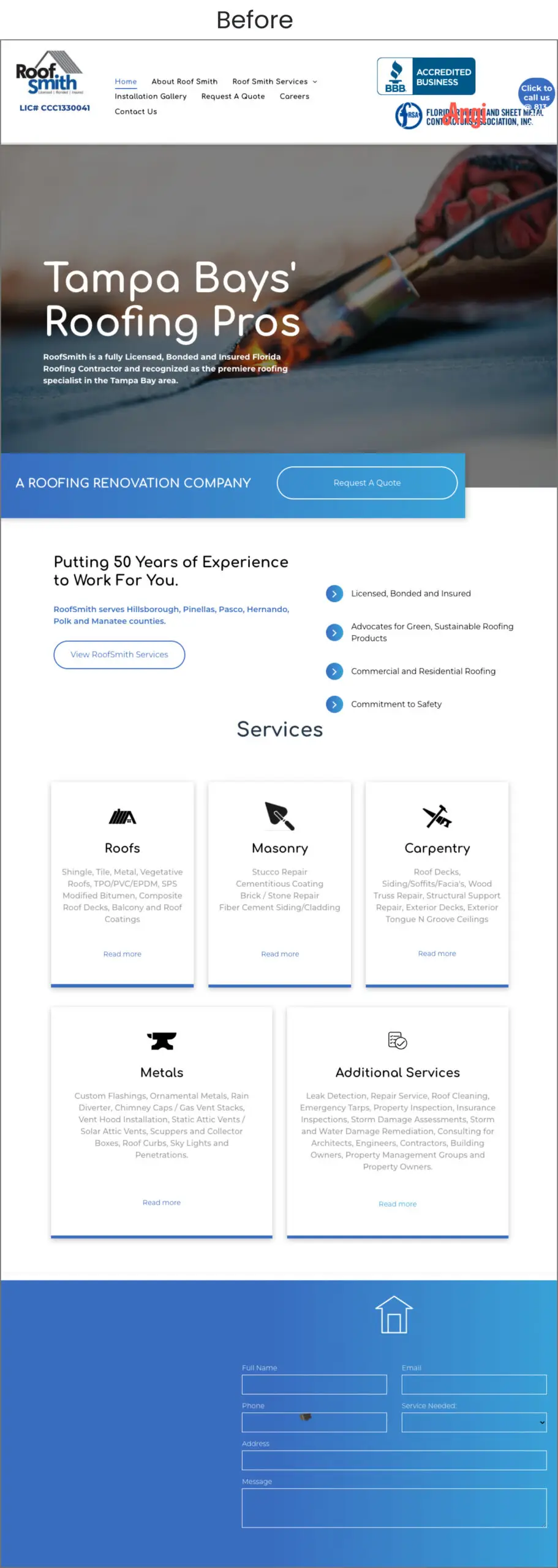
RoofSmith’s previous logo and website no longer aligned with who the company had become. Visually, the brand felt dated and inconsistent across digital and physical touchpoints. The website lacked clarity, hierarchy, and a clear path for users to understand services or request a quote, especially on mobile.
The challenge was to:
Create a modern, confident identity that still felt rooted in craftsmanship and trust
Develop a logo system that could scale across trucks, uniforms, signage, and digital platforms
Redesign the website to be clear, mobile-first, and conversion-focused, without overcomplicating the experience
Strategy
The rebrand focused on clarity, strength, and longevity. Rather than chasing trends, the goal was to build a visual system that would feel relevant for years and adaptable across all brand touchpoints.
Key strategic decisions included:
Simplifying the brand mark into a strong, geometric symbol that references protection and structure
Establishing a cleaner typographic system that feels modern but dependable
Designing a website experience that prioritizes ease of navigation, service clarity, and trust signals
Logo & Brand Identity
The new RoofSmith logo was designed to feel solid, balanced, and instantly recognizable. The mark abstracts the idea of a roof into a more geometric, shield-like form symbolizing protection, reliability, and expertise.
Supporting elements such as color, typography, and spacing reinforce a clean, professional tone that reflects the quality of RoofSmith’s work.
The identity system was built to be:
Highly legible at any scale
Flexible for use on vehicles, apparel, signage, and digital media
Timeless rather than trend-driven
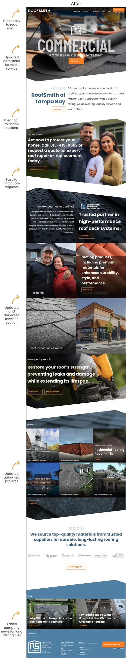
With the new logo established, the brand was translated into a modern web experience
Website Inventory
We began by taking a full inventory of the existing website, evaluating content, structure, and user flow to understand what was working and where improvements were needed. This audit informed a new framework focused on clarity, hierarchy, and usability: streamlining navigation, refining content organization, and establishing a scalable structure that better supports RoofSmith’s services, messaging, and future growth.
Key improvements include:
Reviewed existing site structure, navigation, and page hierarchy
Audited all content to identify what to keep, revise, or remove
Evaluated user flow and friction points, especially for quote requests
Mood Boards
We created website mood boards to explore visual direction and user experience concepts, presenting them to the client for feedback. Based on their input, we refined the designs and finalized a cohesive look and feel that guided the website’s layout, typography, color palette, and overall aesthetic.
The Result
The refreshed brand and website present RoofSmith as the established, professional company they are: confident, trustworthy, and easy to work with. The new visual identity provides consistency across all platforms, while the redesigned website creates a clearer, more engaging experience for potential customers.
Together, the logo and website elevate RoofSmith’s presence in a competitive market and better align their digital experience with the quality of their services.
Client Satisfaction
Christopher Queen, Partner at RoofSmith of Tampa Bay says:
“Working with Haneke Design has transformed our brand and digital presence. The new logo and website now reflect who RoofSmith truly is: professional, trustworthy, and easy to work with. The process was smooth, collaborative, and results-driven.”