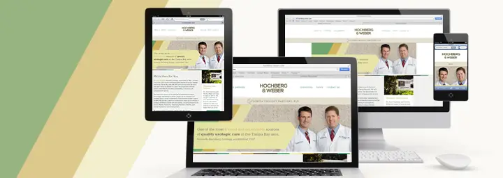

With tablet computers on track to overtake the number of laptops sold and smartphones becoming ubiquitous, today’s web sites need to be designed to give a consistent, high quality visitor experience regardless of the device used to access them. So when it came time to give their web site a makeover, Tampa’s Hochberg & Weber, also known as Florida Urology Partners, LLC, tapped Haneke Design, a responsive web design and development company, to design and develop a new responsive web site for their 45 year old practice. Founded in 1967 by Dr. Bernard Hochberg as Hochberg Urology, the practice has been a trusted medical provider for generations of local families.
“With so many of Drs. Hochberg and Weber’s patients using mobile devices to obtain health information or download forms from their web site, it made perfect sense to use Responsive Web Design to create their new site,” said Jody Haneke, president of Haneke Design. “It’s the most effective path to the mobile web for any business, but especially so for those that don’t have a need for mobile applications.”
A responsive web site will respond to the viewer’s actual browser size and present the information in a format that is designed for an optimal viewing experience on that specific screen – whether it is a smartphone, tablet, or laptop. Responsive Web Design sites offer easy reading and navigation without a need to resize, pan, pinch, or scroll.
The Hochberg & Weber web site features a warm color palette and understated details that reflect the feel of the practice’s comfortable, inviting, and friendly offices. Built using WordPress with a custom responsive theme, the navigation changes to a drop down menu when accessed via a mobile device for easier scrolling.
All of the Hochberg & Weber site’s content is available on mobile and tablet resolutions to afford visitors the same content and information regardless of the screen they are viewing. Haneke Design also used retina graphics to ensure optimal clarity for viewers accessing the site on devices with retina display.